


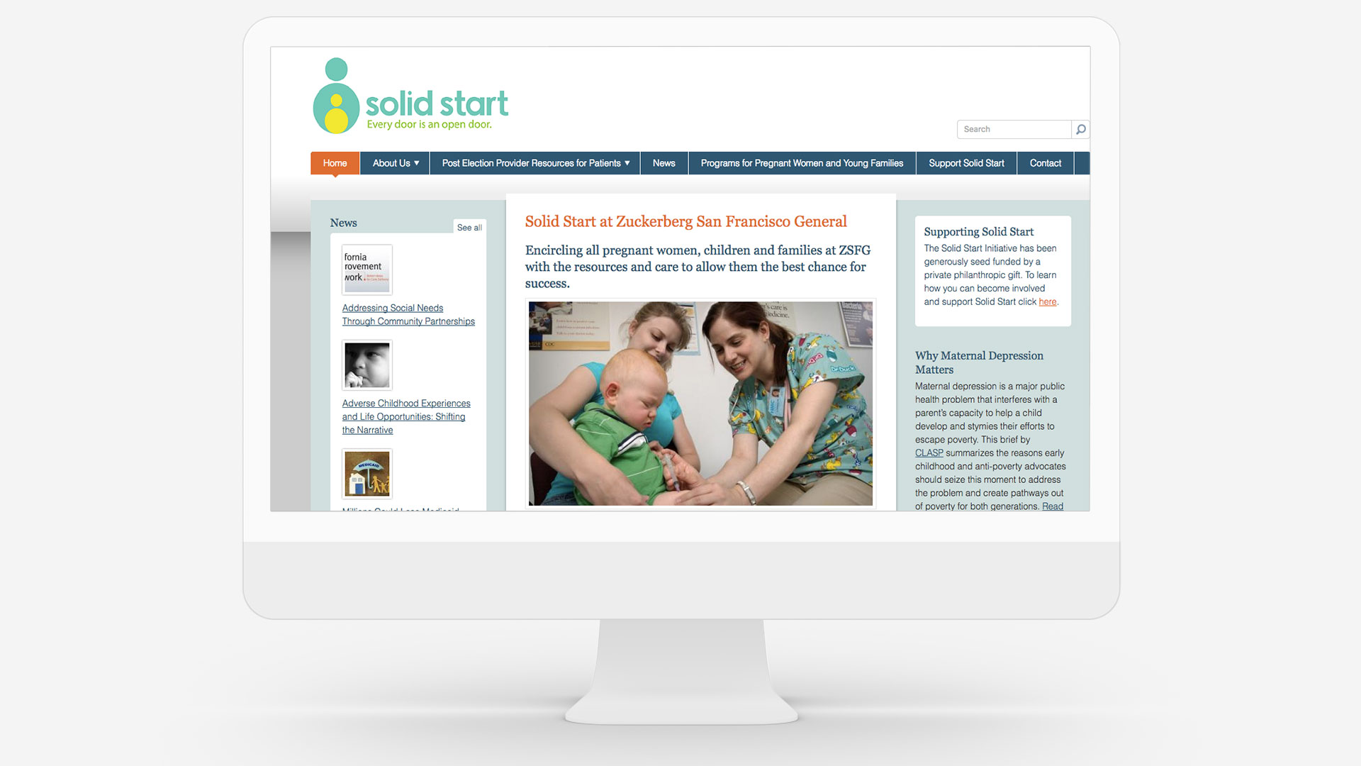

One of my VTO (Voluntary Time Off) assignments was to create a logo for the Solid Start at the Zuckerberg San Francisco General Hospital.
The logo was designed to evoke stability, love, strength and care. The parent(s) step to give their child a solid and fresh start. The shape of the parent holding the child is an easily, recognizable and welcoming form to the Solid Start parent(s) – not to be too sophisticated or unapproachable. The circle is a form celebrating unity and wholeness. Parent to child and child to parent.
The lowercase letterforms emphasizes a friendly environment. The tag line was set in sentence case to continue the feel for the parent as a trusted, responsible, and valuable experience for the family.
2016
I created a mix of dynamic fun colors with illustrations to accompany written materials. These elements communicate health, science, wellness and happiness without being intimidating.